Bell Curve
Where it came from
This format emerged around 2017-2018 on 4chan and Reddit, building on the controversial practice of using bell curve statistics to make jokes about intelligence distributions across different groups.
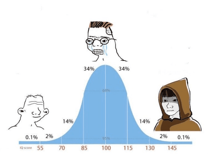
The meme uses a bell curve graph (the normal distribution you learn about in statistics class) with three characters positioned at different points. The center represents the "average" person, while the extremes on both sides show exaggerated or absurd character types. It's essentially a format for making jokes about where people fall on a spectrum of something — IQ, competence, taste, whatever. The humor comes from the ridiculous character designs and the implication that most people cluster in the middle while the truly weird ones exist at the extremes. People started using this to mock different groups, make self-deprecating jokes, or just show silly progressions from normal to unhinged.
Search interest, over time
↳ data courtesy of google trends


